
Image Credit: https://neilpatel.com/blog/technical-seo/
We’ve put together a few key points on how mobile-friendly web design (also called “responsive website design”) helps your website’s rankings in Google search.
Reduced Bounce Rate
The time that users spend on your website correlates with your Google rankings. Google looks primarily at two things – how long people stay on your website, and your bounce rate. What’s a “Bounce Rate”? Basically, it goes like this: If someone clicks through to your website, doesn’t like what they see, and immediately “bounces” away from it, that’s counted as a “Bounce”. If your site has a high bounce rate, that means people don’t like it something about it. If users find that the information available on your site is not relevant to what they’re looking for, they’ll bounce off your site and look for answers elsewhere. There is also a tendency for individuals to spend only a second or two on your website if it’s hard to read or poorly laid out.
Responsive web design provides the right environment for users to browse your site comfortably, which will enhance your website’s Google ranking.
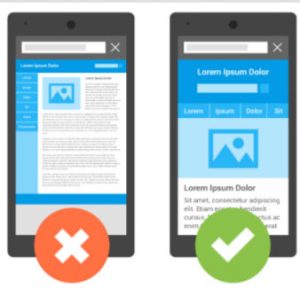
Enhanced User Experience
Businesses that want more website visitors to turn into customers should prioritize responsive web design. When’s the last time you pulled up your website on your phone? Go ahead and pull it up right now and ask yourself these questions:
- Is it easy to read and navigate?
- Is it easy for someone to find your company’s basic information easily?
- Is your phone number clickable to automatically make a phone call to your business?
- Are your contact forms easy to fill out on your phone?
If you answered no to any of these questions, you’re missing out on new customers.
A responsive web design enhances the experience of every user, which will not only increase traffic to your website, but it will also result in more sales.
When a potential customer or current client visits your site their buying journey should be as seamless as possible. That’s only possible by improving the user experience through responsive web design.
Faster Loading of Web Pages
A mobile-friendly website loads quickly on phones and tablets. Your website’s speed is one of the most important aspects Google looks at to determine your website’s rank. Oftentimes, a cell phone’s data connection is not as fast as a desktop internet connection. So if there is any lag time when your website is loading on mobile devices, you can expect that to negatively impact your Google rankings.
Think about it – if a person has to wait for your site to open on their phone, they will more than likely bounce off, and go to the next website. So if you want to increase your sales and acquire more customers, a mobile-friendly website is a must-have for your business.
If you’re not sure if your website is mobile-friendly, visit our website’s home page and scroll down until you see our free website analysis tool. This tool will give you a free report that will let you know if your website is good-to-go for mobile, along with a full SEO analysis of your website.

If you have any questions about your website, SEO, or anything digital marketing-related – let us know! We’re here to answer your questions, so contact us today!