
When you’re on the internet, you see hundreds of different spots on websites asking you to subscribe, to sign up today, or to BUY NOW. In our world of digital marketing, these are referred to as “Call-to-Action” elements on the website. Your call-to-action (CTA) is one of the most important elements on your page. It’s the final point of interaction and the last opportunity to convert your visitors. So you need to put some thought into the design, copy, and placement of your CTAs, because it has a huge impact on the number of leads you generate from your website.
So how do you make sure the CTAs on your website are good ones? Follow the guidelines below, and you’ll see more website sales and leads soon.
Elements of an Effective Call-To-Action
Design
- Make your Call-to-Action buttons look like buttons

- Ensure your CTA button stands out
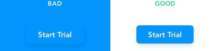
- For clarity, add an explanatory header to your CTA

Placement
Obviously, we want to put the CTA where it will be easily seen. But that doesn’t mean it should be in the middle of the screen. Every business’s product and sales process is a bit different. What might work for one company probably won’t work for yours.
The diagram below (from the old KISSmetrics blog) demonstrates the correlation between the level of complexity and the best choice of placement on your landing page.
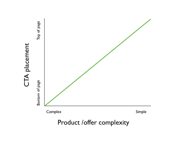
This basically tells us that if your product or service takes a long time to explain, or is a very large investment – nobody reading that page is going to have a quick trigger finger on a “Buy Now!” CTA at the top of the page. You ruin your credibility.
However, if it’s a low commitment, free or low-priced offering – put it right up front where people don’t have to search for it. They just want to subscribe to your newsletter or buy that pack of AA batteries and get on with their lives.
Below is an example of great CTA placement – and one we’re all familiar with: Amazon’s CTA when we’re looking at books on Amazon.com.
It’s always at the top left of the book’s page – where you can’t miss it. Because that’s where we all start naturally reading…top of the page, on the left-hand side.
Makes sense, right?
Copy
Design and Placement are important, but the copy is what will prompt that click. Your copy should get to the point, be clear and simple while compelling action.
According to the digital marketing master Neil Patel, if your copy takes longer than a second to read, it’s just too long. But that doesn’t mean you’re limited to two or three words…This CTA below is an example of a longer one, but it still only takes a second to read.
![]()
The language you use is also important. Consider using the following two techniques.
Use the first-person. Unbounce saw a 90% increase in click-through rates simply by changing their CTA from…
This: “Start your free 30 day trial”
To this: “Start my free 30 day trial.”
Mention the problem that you are solving. Copyblogger saw a 24% increase when they changed their button copy from…
This: “Try Schedulicity Free”
To this: “End My Scheduling Hassles”
So think about your copy, but don’t over-think it. Keep it simple, and remember…give’em what they came for!
As you can see, there’s a lot to think about when creating your CTAs for your site. And believe it or not, CTAs are just the tip of the iceberg when it comes converting a website visitor into a solid lead. From form length, to page layout, to navigation, social proof, and on and on….there’s a lot to think about. But that where we come in. Smart Link Solutions thinks about all of this for you, while you think about your business.
If you would like to know more about how to improve any of your lead generation methods, please contact us!
Special thanks to James Gill at GoSquared for some of the graphics used above!